
Reliaquote has been a long-standing life insurance provider, but at the time found themselves well behind their competition when it came to their web experience and site design.
They wanted to modernize their approach to selling insurance online. I served as the User Experience Designer for this project, lending specific insight into how potential customers could better get the information they're looking for.
Role
UX Designer
Process
UX Design, competitive research, wireframes
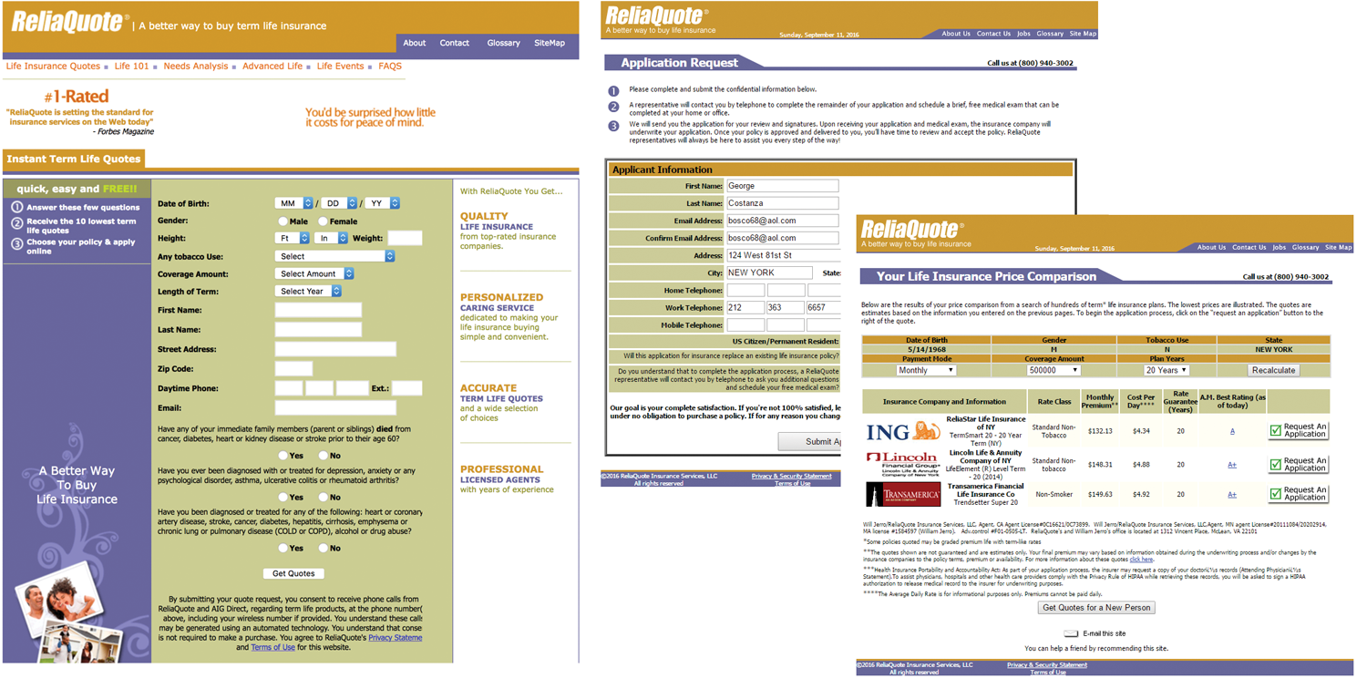 Reliaquote.com prior to redesign.
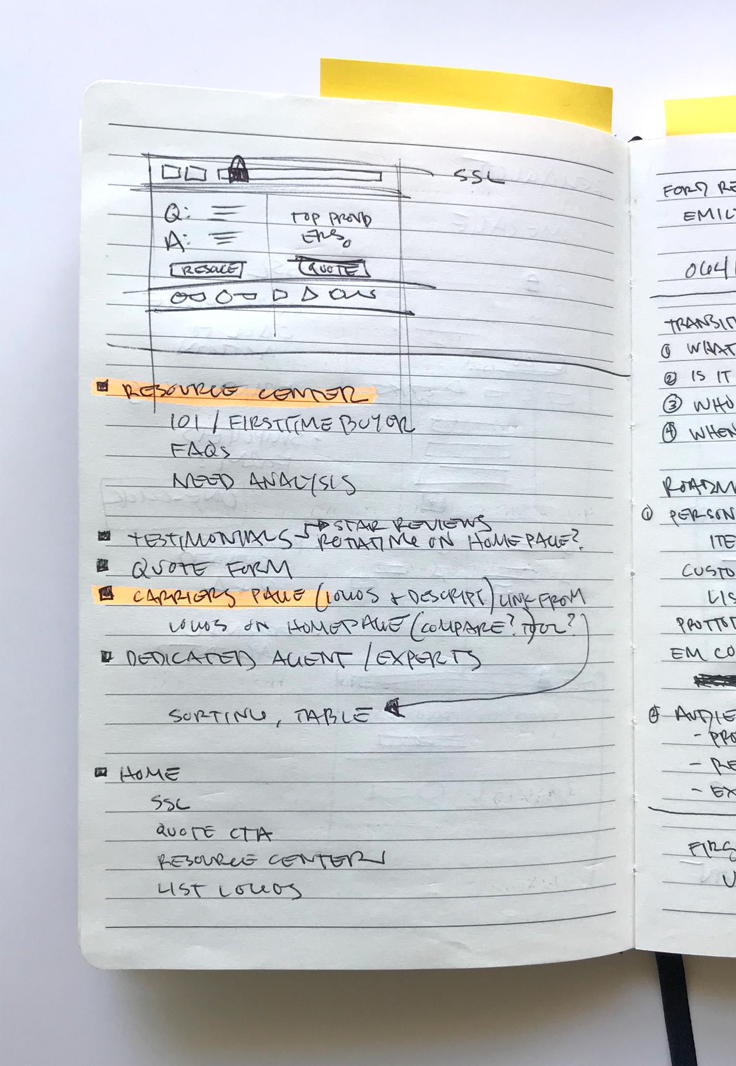
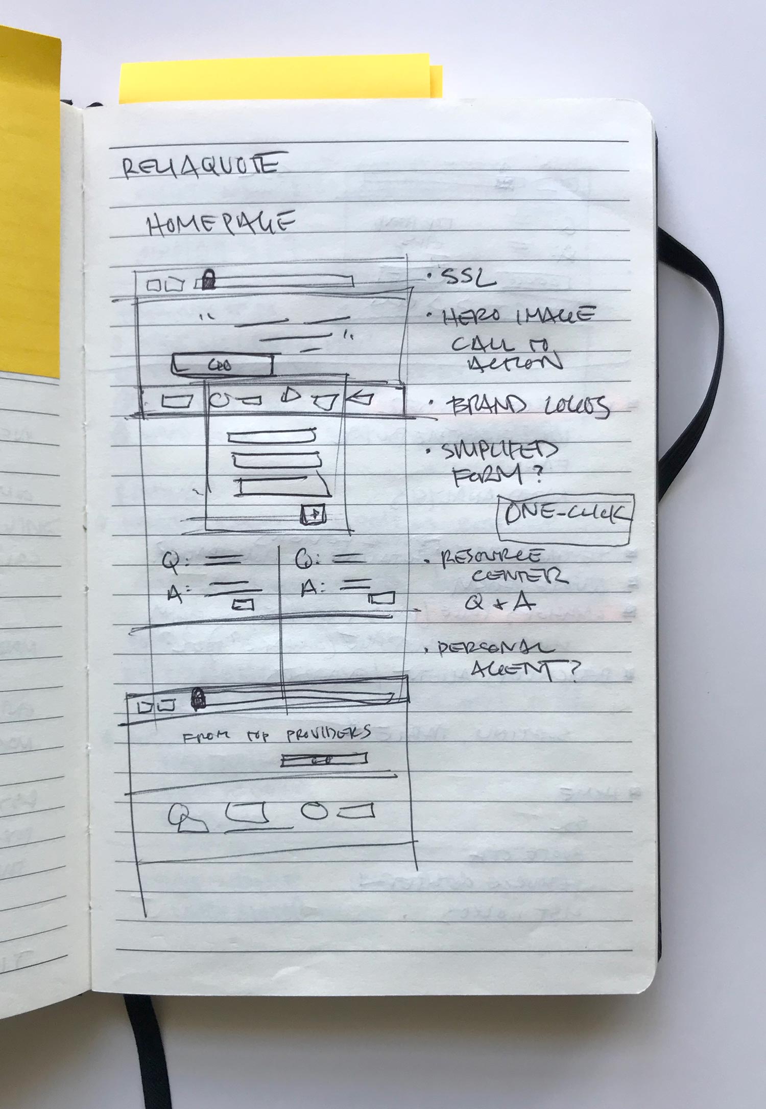
Reliaquote had taken a keen notice in the way their competitors were attracting new customers, and for good reason. The competitive landscape was very mature in their approach to walking potential customers through the life insurance process and this research played a large part in the final solution.
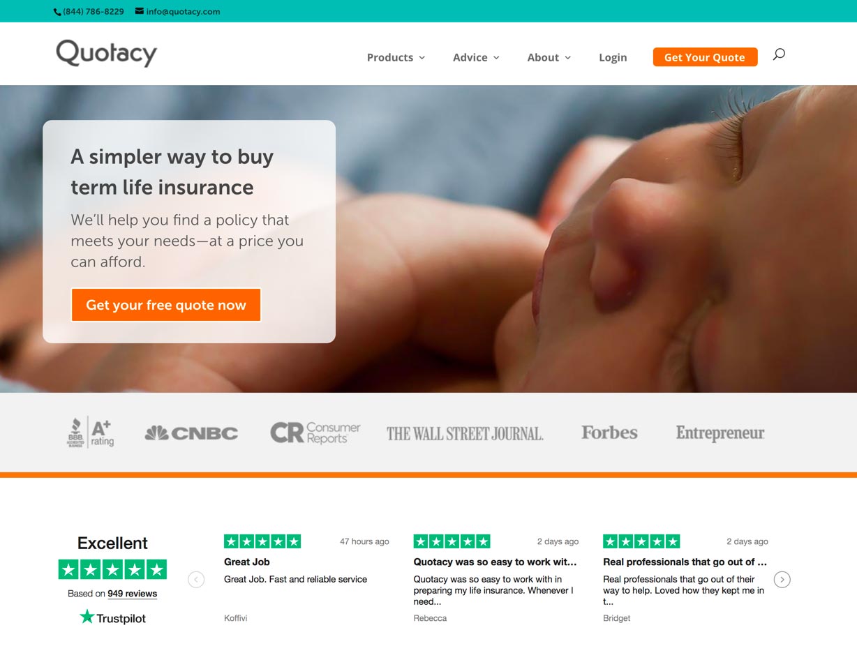

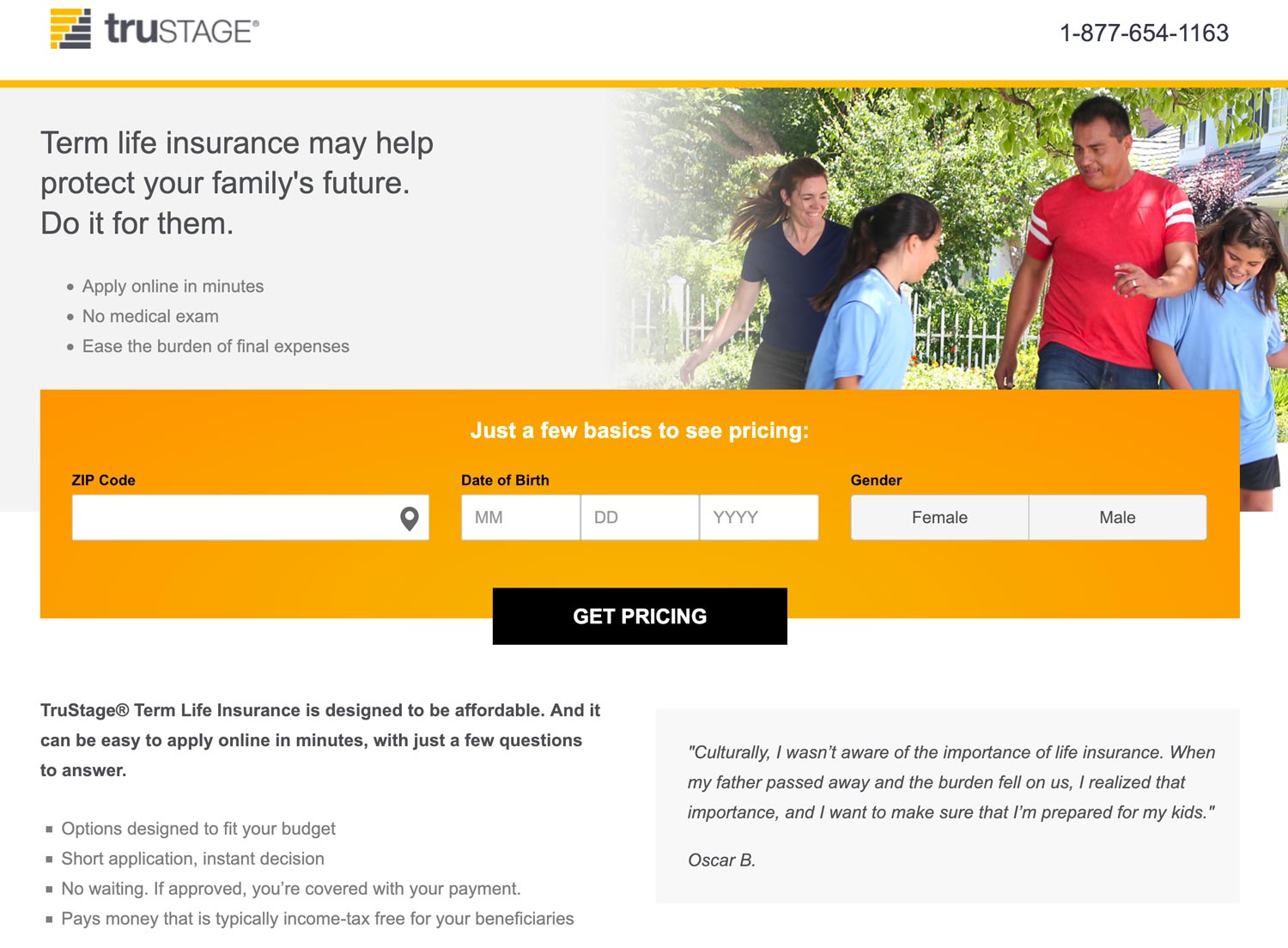

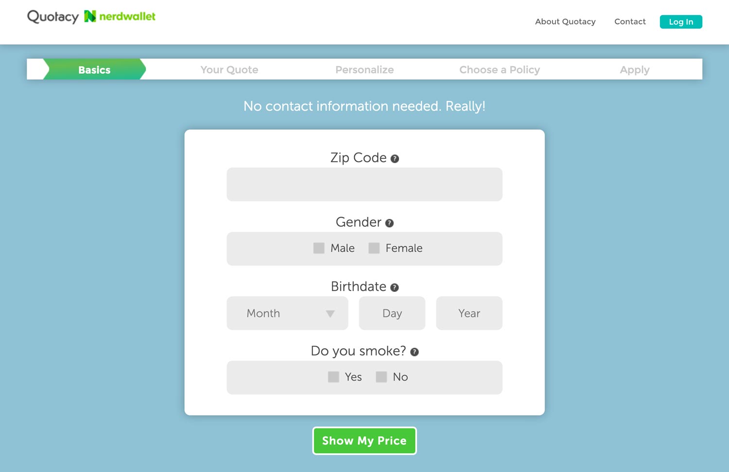
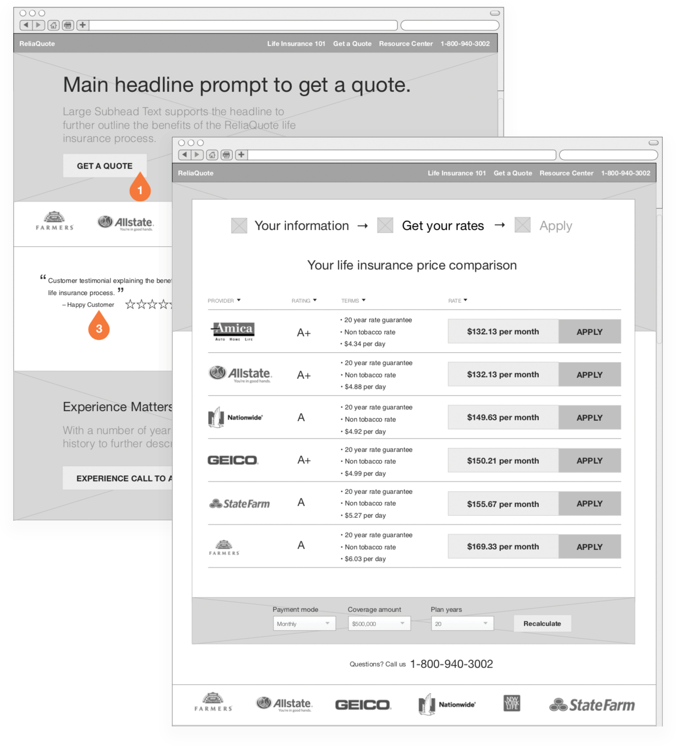
In the end, I provided Reliaquote with a detailed set of high-fidelity wireframes that outlined a key set of customer experiences. Focus areas included the initial prospective touch-point, the user flow for acquiring prospective customer information and making sure that flow was as concise as possible, and the research center which was broken up into a number of formats from FAQs to videos.
My wireframes were handed off to a visual designer who used that as a guide for the actual visual design of the website.
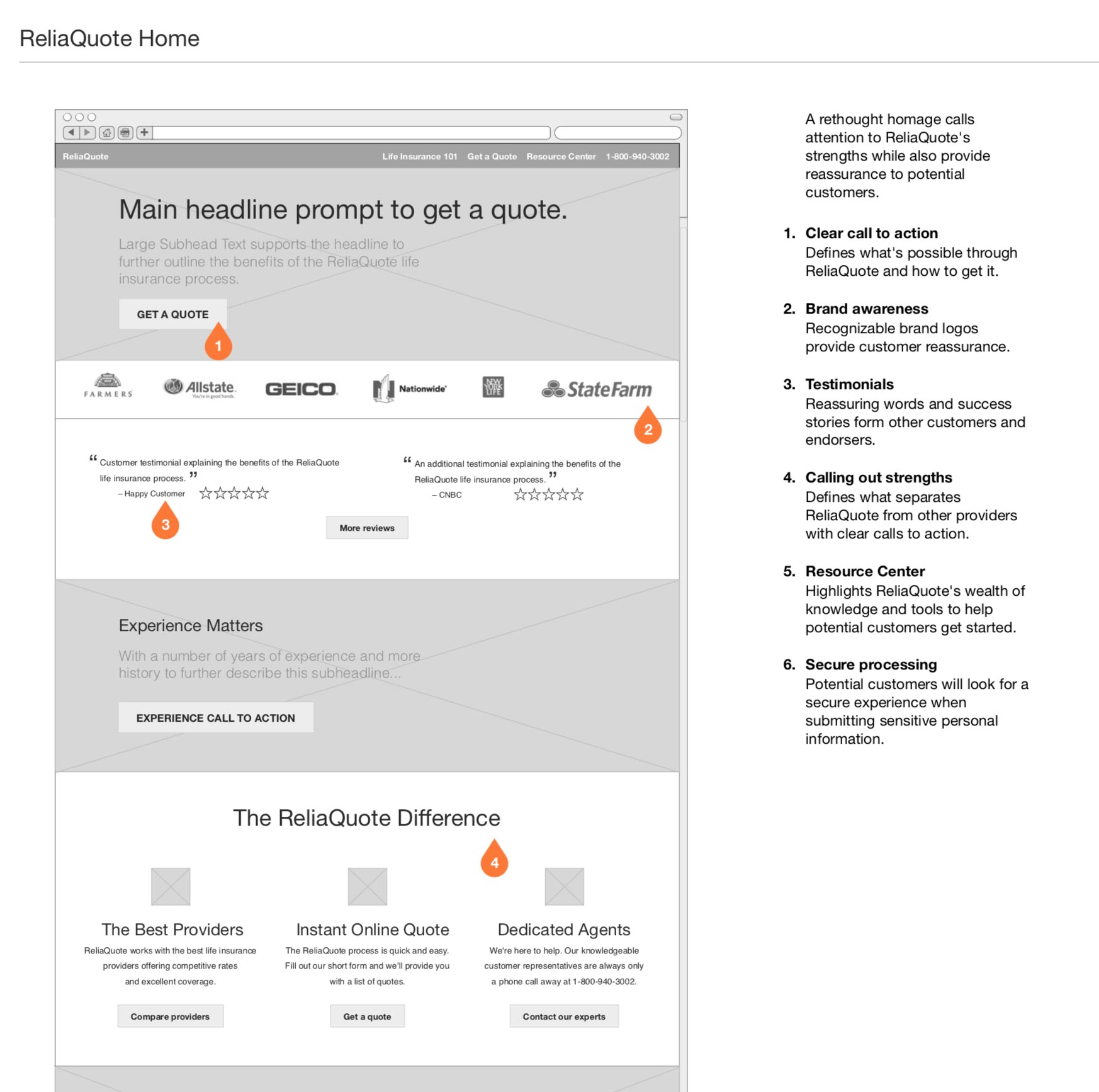
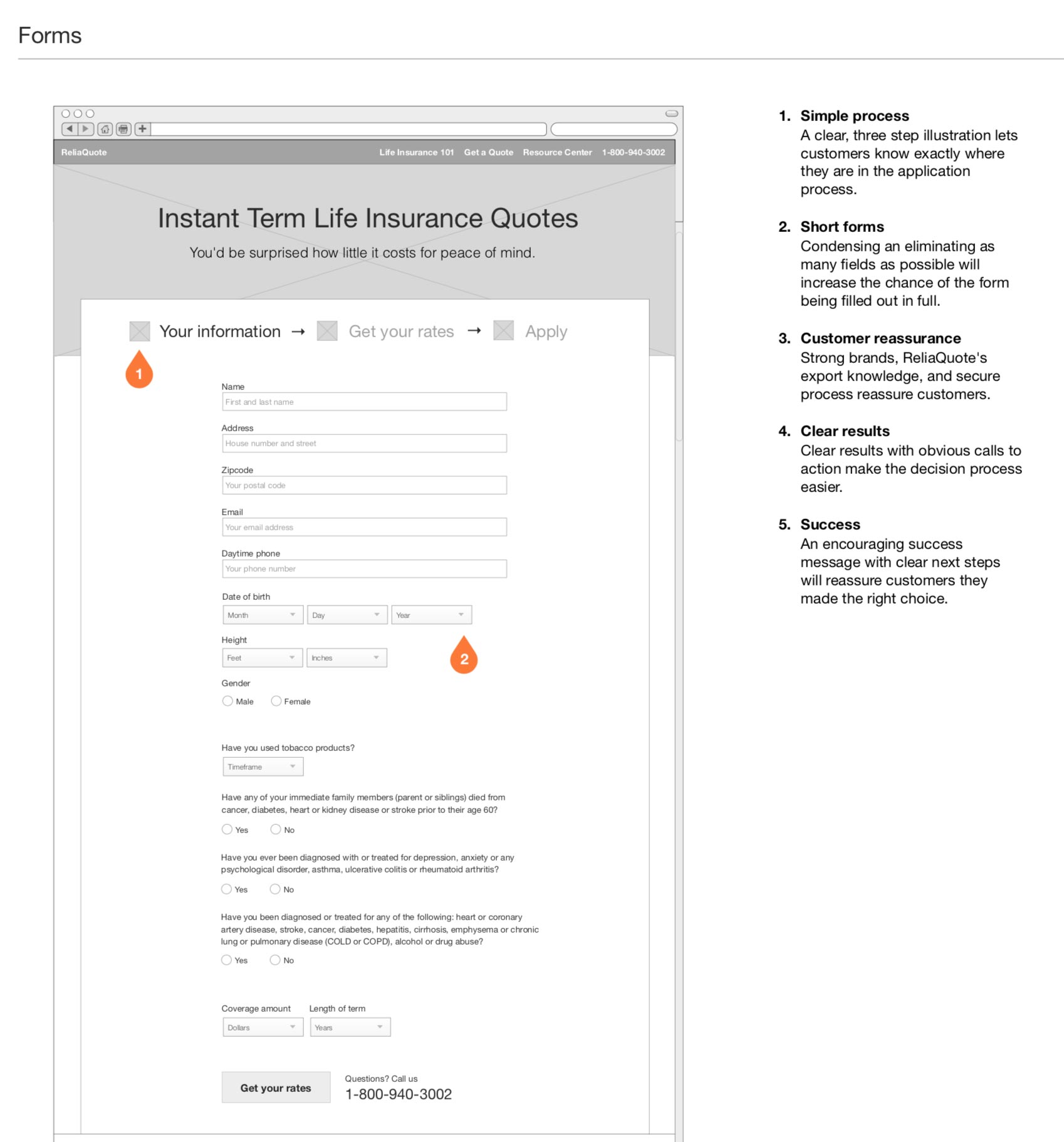
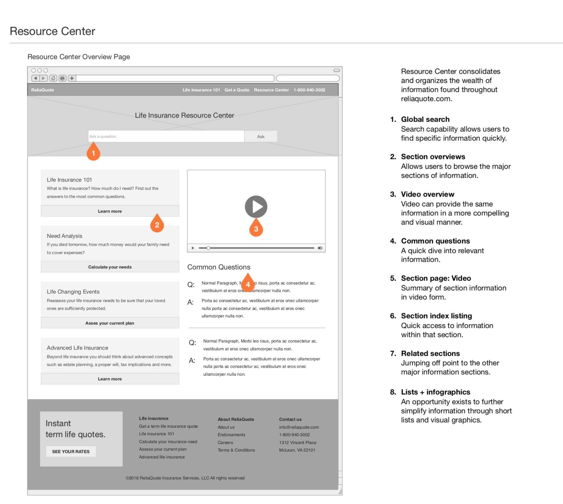
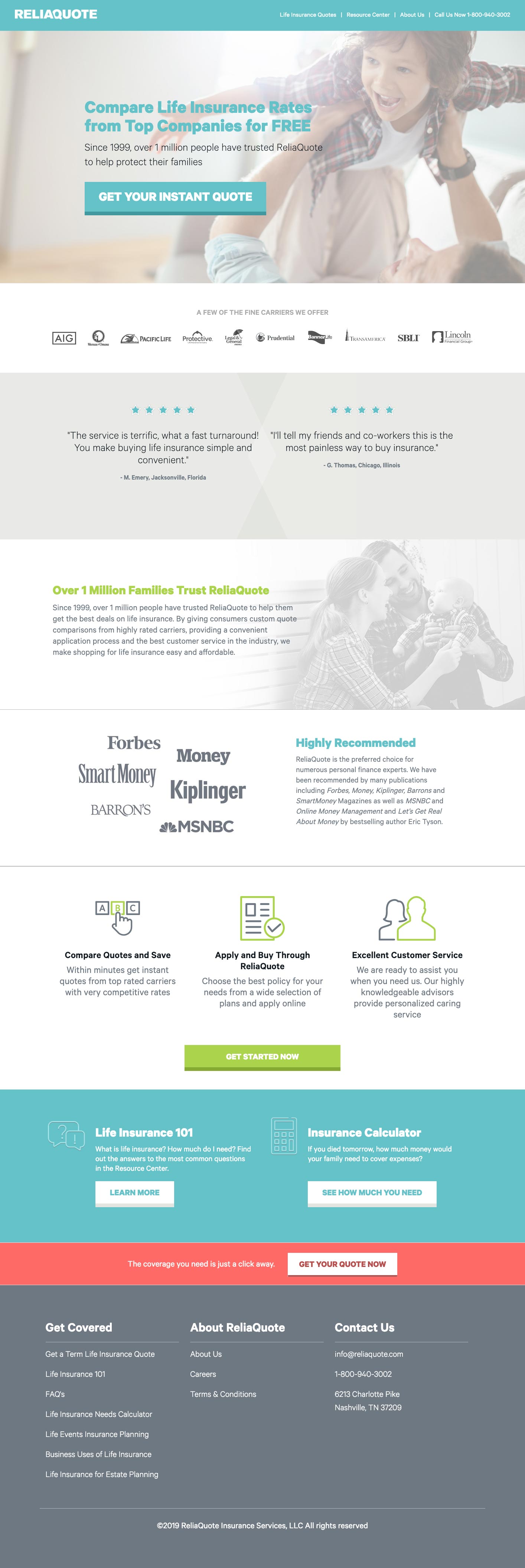
Wireframes were handed over to a separate design team to implement the final visual design of reliquote.com