This project was designed to push the boundaries of what an email marketing platform could offer a marketing team. The business wanted to move beyond a simple set of utilitarian bulk email tools.
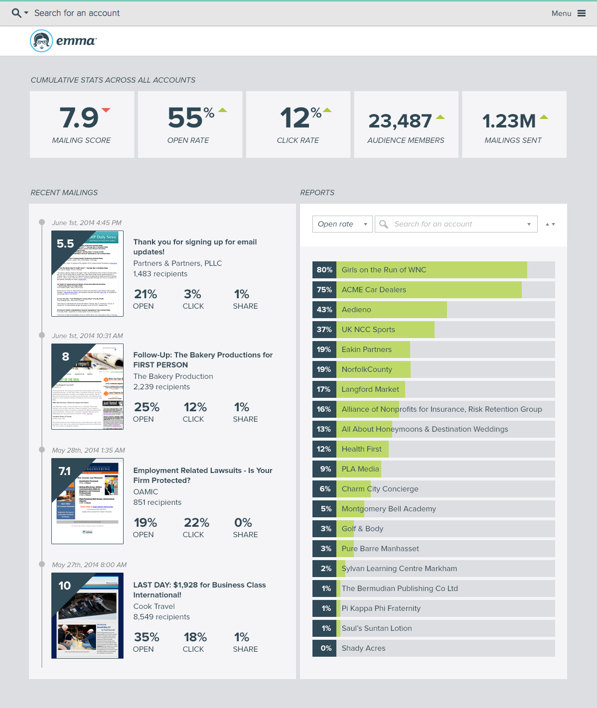
We wanted to explore a new level of metrics and reporting, how we could help marketers better understand their audience, and how we could make the product more intuitive, with the end result of getting the customer more invested in the platform.
Role
UX Designer, Visual Designer
Process
UX + UI Design, wireframes + prototypes
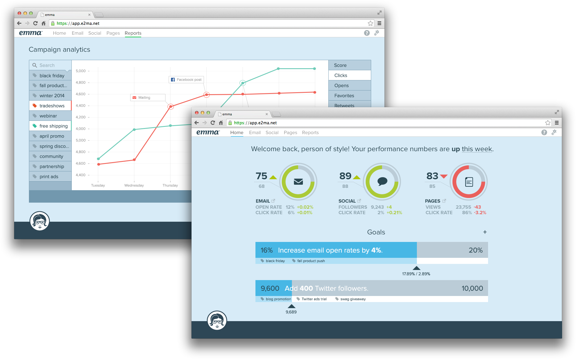
At the time, the Emma platform was well-respected for its ease of use, but beyond building emails to send to customers in bulk, there wasn't much to offer in terms of insights. We wanted to solve several areas of concern:
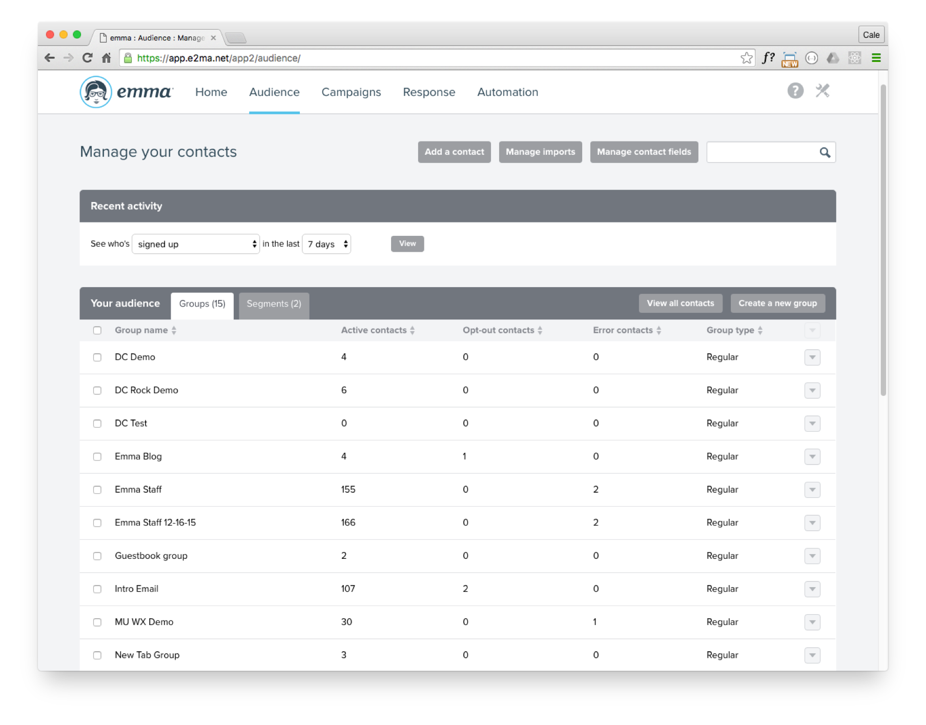
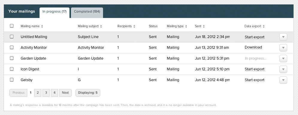 Emma email platform prior to redesign.
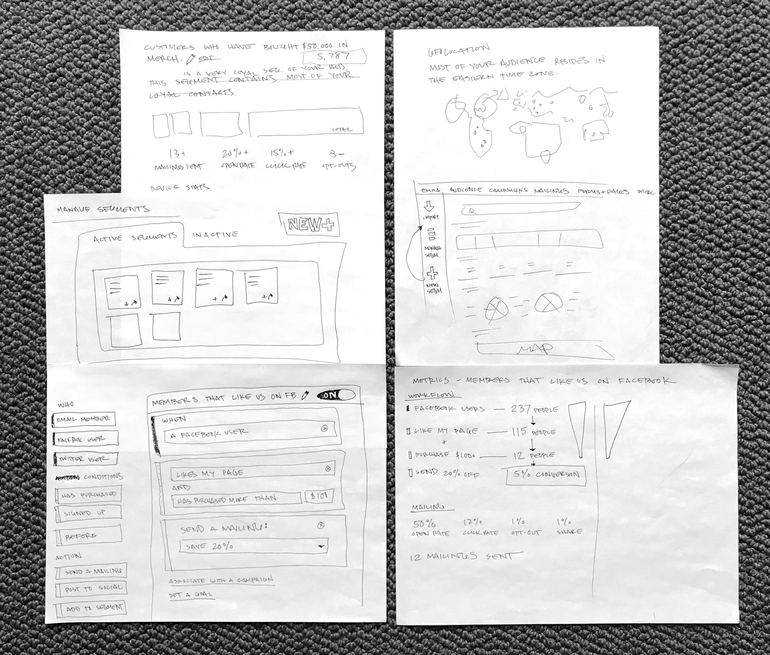
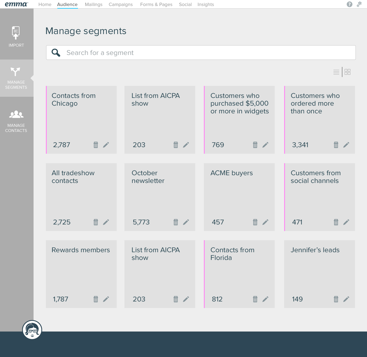
Every aspect of the Emma platform was redesigned and rethought from the ground up.
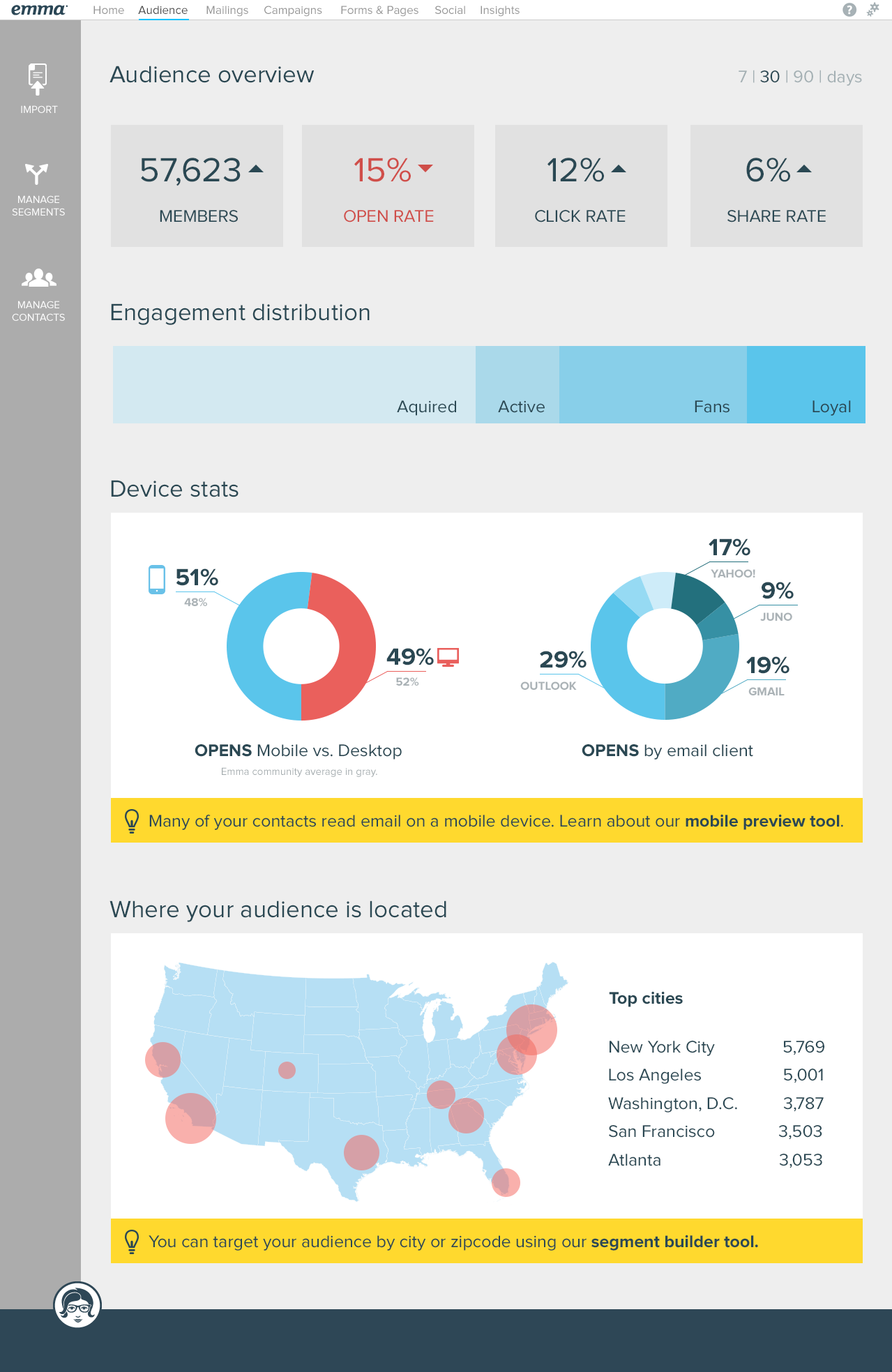
Focus was put on audience members including surfacing overall engagement metrics, where audiences were coming from, high-level demographics like location and device types. Engagement levels were surfaced to give the marketer an idea of which percentage of their audience was interested in the content being sent.
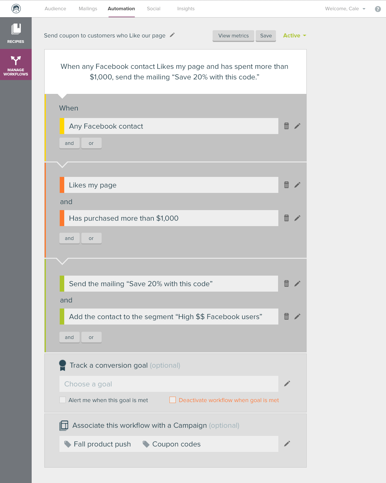
Automation tools like predefined recipes for creating successful automated email campaigns were another big focus area. With a wealth of existing customer data, Emma could provide quality marketing advice to all customers.
While this was a vision exercise, many of these ideas have begun to make their way into the Emma platform for our customers to utilize each day.
